

We have completed the final draft of our music video. The final piece was created on Final cut Express. We shot our video on 720p, so we also wanted to export it in 720p for better viewing. We went to the settings Export using Quicktime Conversion, then when the window had appeared we made sure it said Quicktime movie and default settings. We compressed our video on MPEG-4 Video and made the quality best. We then chose the size as HD 1280 x 720 16:9, and clicked the box that said deinterlace source video. When it came to sound quality we changed the format to AAC, Stereo (L R) and rate to 44.100. The render settings of the sound of the quality was best, and the target bit rate at 192kbps bit rate. We then exported our video, then directly uploaded it to youtube.
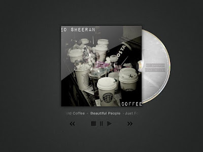
 I will improve my digipak by adding more of a range to it. When it comes to the CD I will use my actual image of coffee to make the CD have a unique look to it. When it comes to my covers, I will not change much, apart from adding a series of images related to the back cover, and a cup of coffee or several acting as the image for my artist. I will change the tones on the poster to make it pop out more and look more effective.
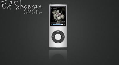
Within the creative process of my album cover, I came to the conclusion that I needed to create an album cover, and I decided to create three so that I had choice. Through my research I concluded that the album cover's for my indie genre do not usually include the artist on the front cover, and I decided to name my album cold coffee, so I decided to use and image that incorporated that. The three first cover had a font which was nice to look at, but as an album cover the second font seemed more pleasing. I then had to choose from the last two album covers. One with a sepia type tone, and one that had very few colours in. I chose the one with very few colours, as it had some colours, and gave the album an organic feel as it seemed as if that was how London looked like.
To begin with I wanted to experiment with changing the tones and levels of my image, so I decided to experiment with this image that I had previously taken.
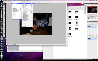
I went to image>adjustments>levels and then proceeded to change the effects so that I could have a misty effect.
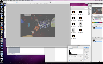
The misty effect was done to give a nostalgic look.
To begin with I wanted to remove the blemishes from my artist’s face. I duplicated the layer, so that it could be edited, and I then used the spot removal tool, to remove minor blemishes, but this would not completely do the trick.
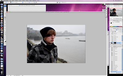
After I had used the spot removal tool, I then proceeded to try and attempt airbrushing the artist. To airbrush the artist I pressed filter > sharpen > unsharp mask, and set the amount to 92%, radius to 1.0 and threshold to 0. I then proceeded and pressed filter> noise> add noise, and changed the amount to 0.7. Then to conclude I pressed filter>blur>Gaussian blur and then set the radius to 2.6.
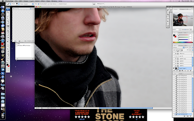
After I had done this the image was all blurry, but I only wanted his face to look smooth, so I created a layer mask, then used the paint bucket to paint the image black, and it was clear again because it was only showing the layer below then I used a white brush to paint the places I wanted my image to be airbrushed.
