Kay's final evaluation media from Kay Ibrahim on Vimeo.


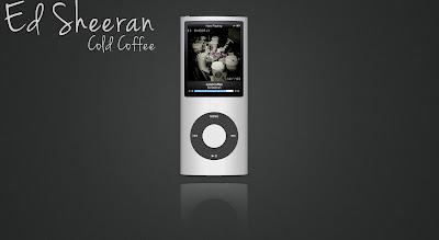
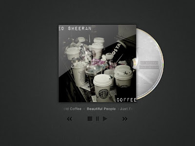
 This are comparisons with my digipak and existing products. My album cover is similar to coldplay's parachute album due to it having a picture of an object or objects, rather than having the artist on the front cover, and the same goes with the CD, except the CD is from the arctic monkeys album whatever people say I am, thats what I'm not.
My back cover is from the same artic monkeys album, and has someone covering their face.
Can you please look at my survey, and answer them in relation to my music video. Thank you.


We have completed the final draft of our music video. The final piece was created on Final cut Express. We shot our video on 720p, so we also wanted to export it in 720p for better viewing. We went to the settings Export using Quicktime Conversion, then when the window had appeared we made sure it said Quicktime movie and default settings. We compressed our video on MPEG-4 Video and made the quality best. We then chose the size as HD 1280 x 720 16:9, and clicked the box that said deinterlace source video. When it came to sound quality we changed the format to AAC, Stereo (L R) and rate to 44.100. The render settings of the sound of the quality was best, and the target bit rate at 192kbps bit rate. We then exported our video, then directly uploaded it to youtube.
 I will improve my digipak by adding more of a range to it. When it comes to the CD I will use my actual image of coffee to make the CD have a unique look to it. When it comes to my covers, I will not change much, apart from adding a series of images related to the back cover, and a cup of coffee or several acting as the image for my artist. I will change the tones on the poster to make it pop out more and look more effective.
